New Interface 'Cosmic Panda' Gives Youtube Viewers Various Advantages
Youtube yesterday unveiled its new interface called the "Cosmic Panda," which is available for test drives now.
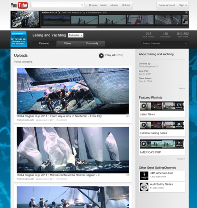
Aiming at improving the video-watching experience, Youtube is hoping to optimize several of its fronts that it believes will please viewers, including making it easier "to find, view and highlight new or featured content," read its website.

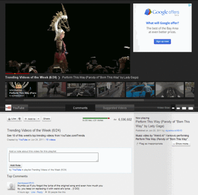
The most notable change is not only how the interface now looks, namely the dark background and larger playlist icons, but Youtube now allows you to comfortably watch your video while browsing through channels. That's right, you'll notice that clicking on the username of the uploader will not stop the video and take you to the channel altogether, but the channel should appear while the video continuously plays on the top left corner, like shown to the right.

It provides four different video sizes and Youtube promises the new design will allow viewers to focus more attention on the video you watch.

Cosmic Panda also features "templates," which give users the option to choose one out of four templates or layouts for better or more comfortable viewing of the video and the playlist.

The names of the templates are representative of the type of use intended, including the Creator template, the Blogger template, the Network template, and the Everything template.
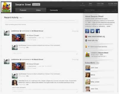
Another noteworthy addition is the "Community Bar," which is basically a tab that displays all of your channel comments, recent activity, bulletins, and subscribers. The bar is editable and you can choose what you want public and what kept private.
If you want to go for a test drive or want more information, click here.


